October 2023 - February 2024
Improving Patient Care Through Continuous Learning
A Continuing Professional Development (CPD) App for Ambulance Clinicians
Summary
I designed a concept app for ambulance clinicians.
It addresses the challenges of continuing professional development (CPD) by providing a centralised platform for tracking, managing and accessing CPD content.
Potential Benefits
Improved workforce competence
Higher quality patient care
Risk mitigation
Reduction in training costs
Project Type
Concept app.
Elements Within My Role
UI design, UX research, prototyping & user testing.
Try the Protoype
What needs to be solved?
Ambulance clinicians need a better way to manage their CPD which will lead to enhanced skills and a higher quality of patient care.
They need an easier way to store certificates, track their progress, find relevant activities and access educational content.
A Unique Perspective Within My Role
I undertook this project whilst I was working with the Scottish Ambulance Service as a patient transport care assistant having previously served for 14+ years as an emergency medical ambulance technician.
Drawing on my experiences as a technician, I gained a unique perspective that helped me empathise with users.
In my UX researcher role, I collected data from clinicians through questionnaires and interviews, synthesising results to define the problem. Transitioning to the UI designer role, I handled ideation, wire framing, and prototyping.
A Conversation in the Break Room
The catalyst for the project was a conversation I had with a paramedic in the break room.
They were sharing their experience of a recent webinar they attended and expressing the challenges they faced in managing their CPD.
That conversation sparked an idea - what if I designed an app that could help?
Suspicions Confirmed
Chatting with colleagues highlighted that there are issues with CPD management.
I started the research stage by designing a questionnaire to understand how clinicians presently handle CPD.
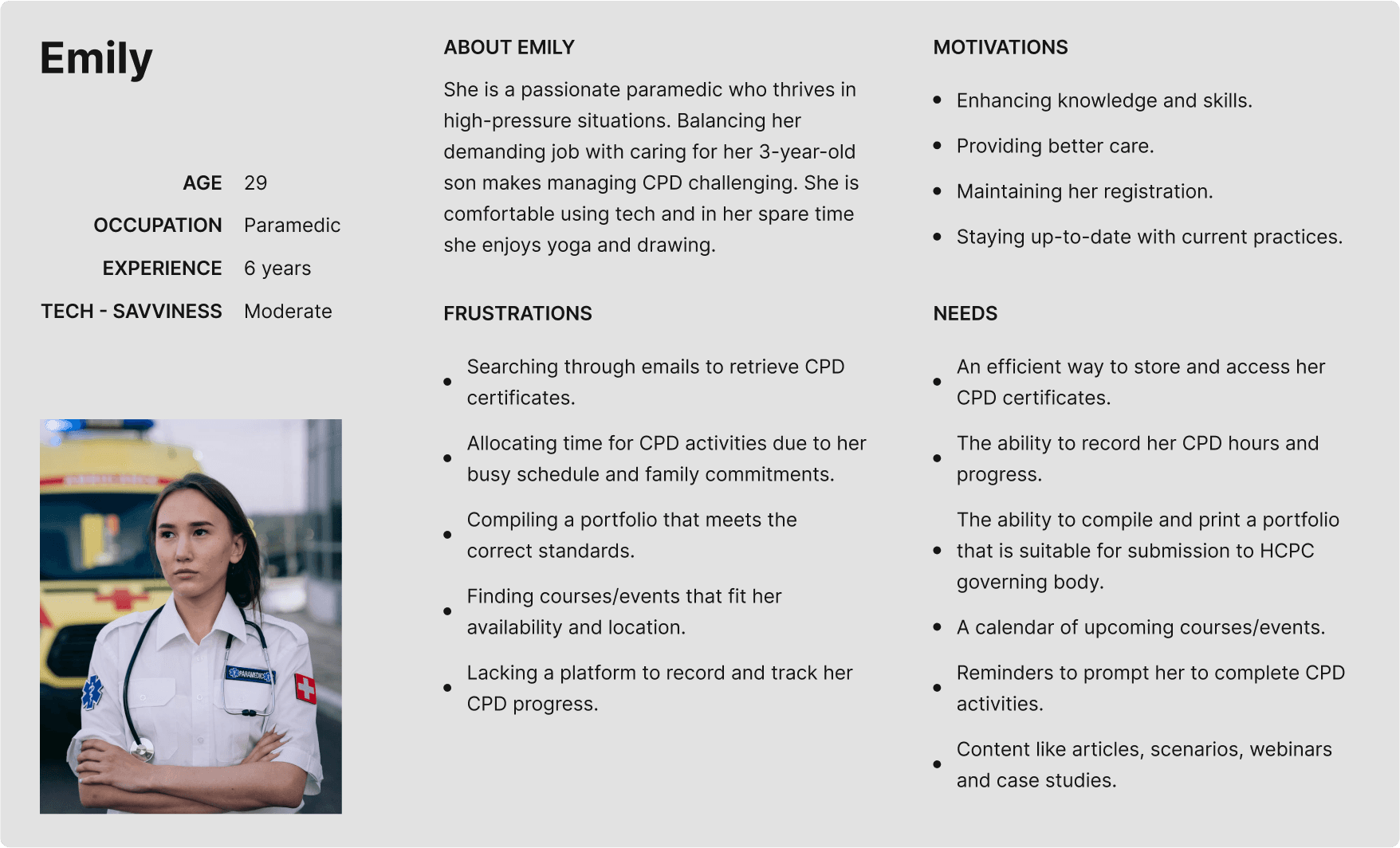
The feedback received highlighted several pain points, and allowed me to develop a user persona and a well-defined problem statement.
Key Difficulties With CPD Management
Busy lives and shift work hinder their ability to engage in continuous learning.
Disorganisation of CPD Materials
Organising CPD materials, including certificates and write-ups, is a hassle.
Limited Access to Relevant Courses
Challenges accessing courses that are conveniently located and relevant to their practice.
Current Apps
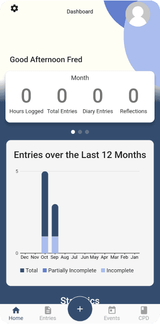
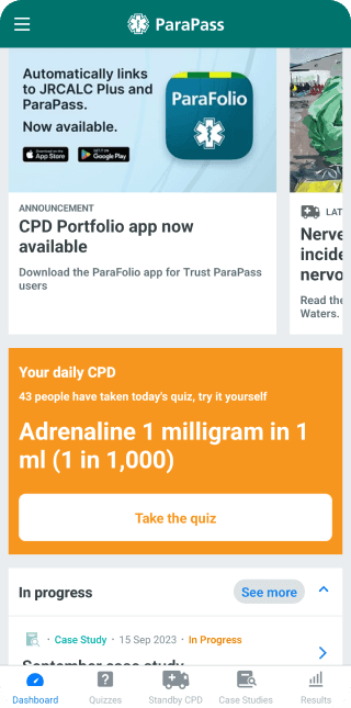
CPD Me and Para Pass are the most common CPD apps used by clinicians. Through my research and chatting with users of these apps I discovered that a combination of both apps would be the ideal CPD app.
Feedback highlighted that the UI’s of these apps was cluttered and the UX could be improved with streamlining and rethinking the information architecture.
What Are You Looking For?
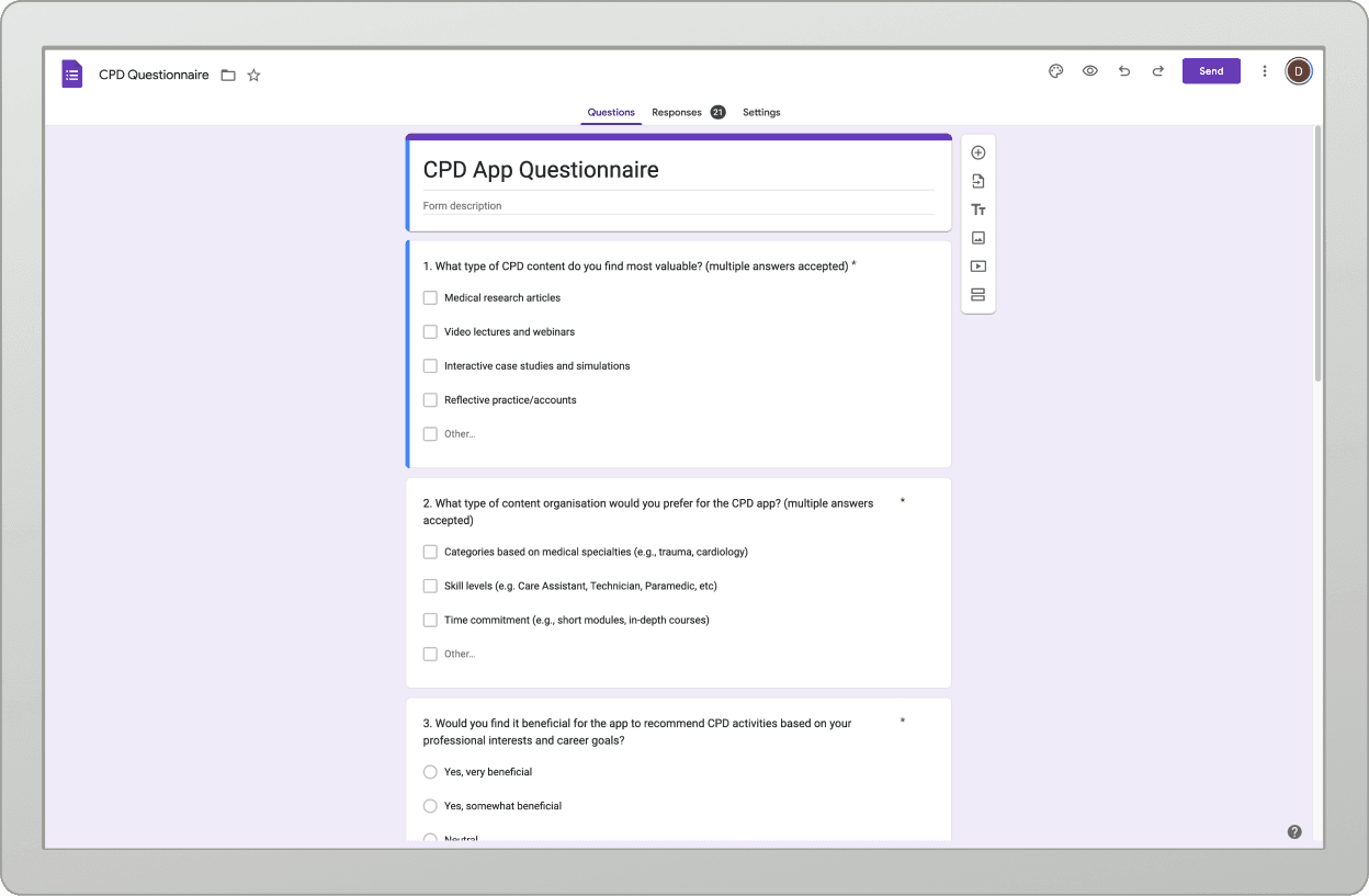
Thinking about app content I produced a google forms questionnaire asking clinicians what they would look for in a CPD app.
I sent the questionnaire to 40 clinicians receiving 21 responses.
App content questionnaire.
That Overwhelming Feeling
Research showed that undertaking and managing CPD can be overwhelming. To ease the sense of being overloaded, I aimed for a UI and UX that is simple, clean and intuitive whilst meeting users needs and content requirements.
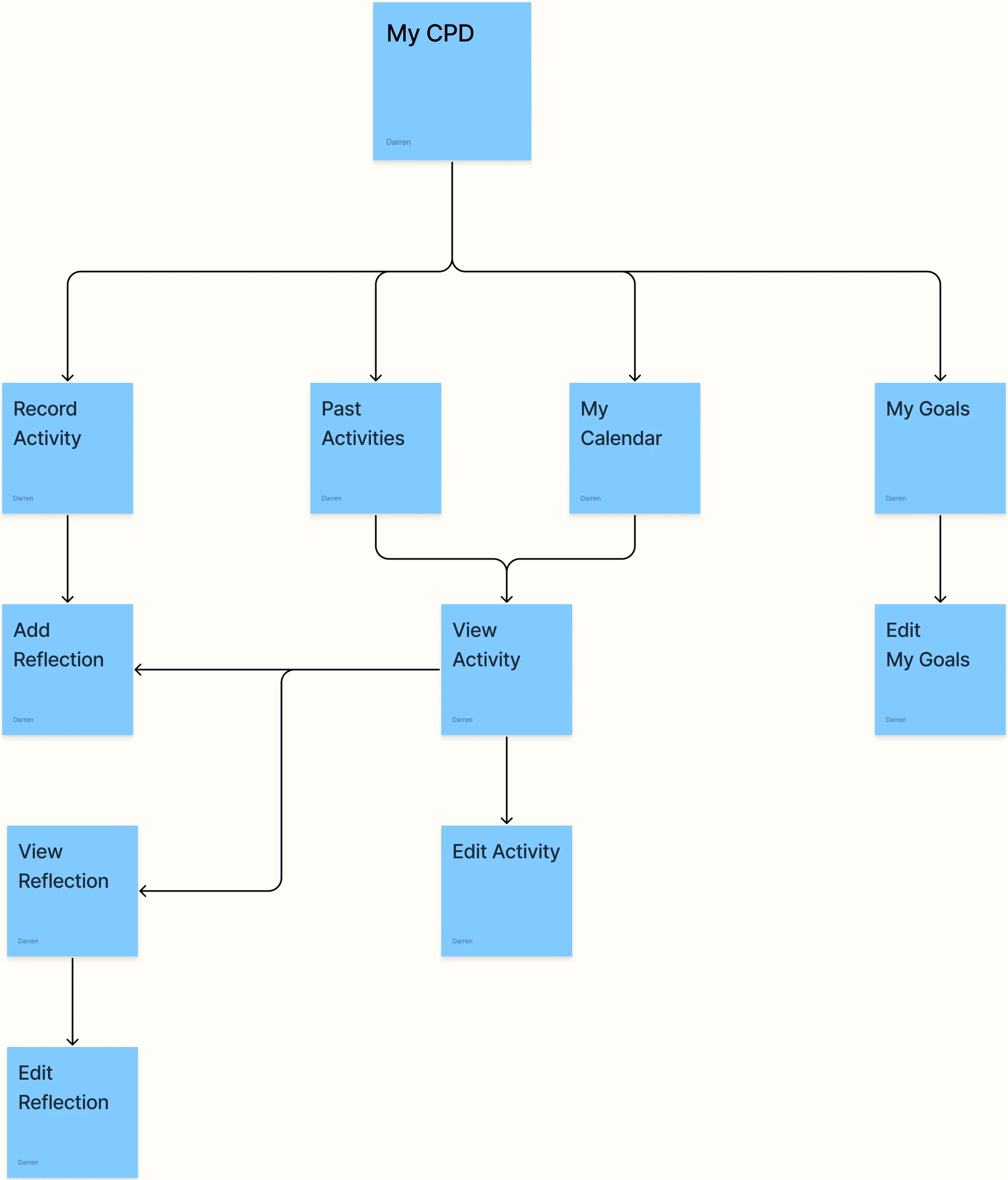
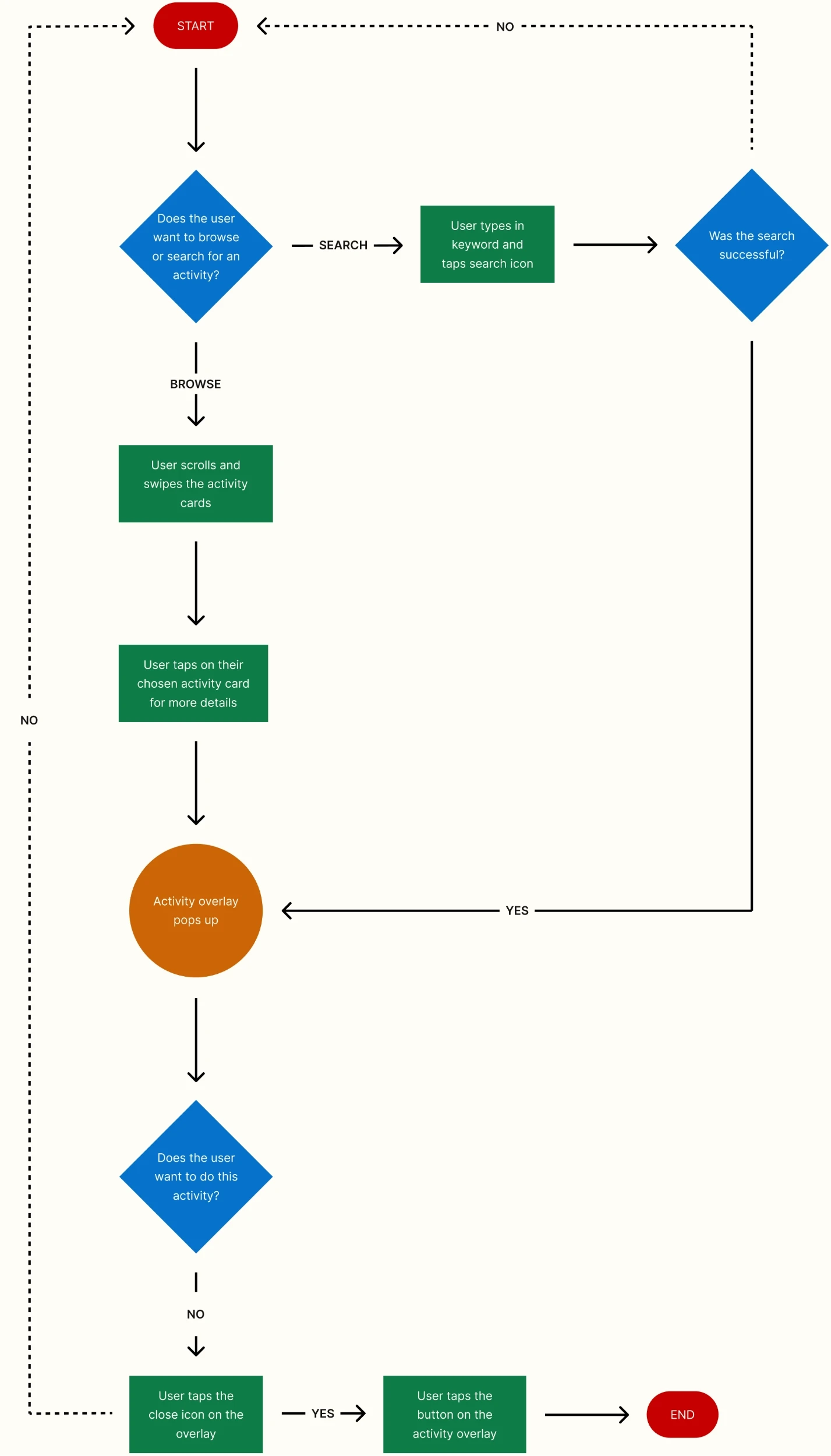
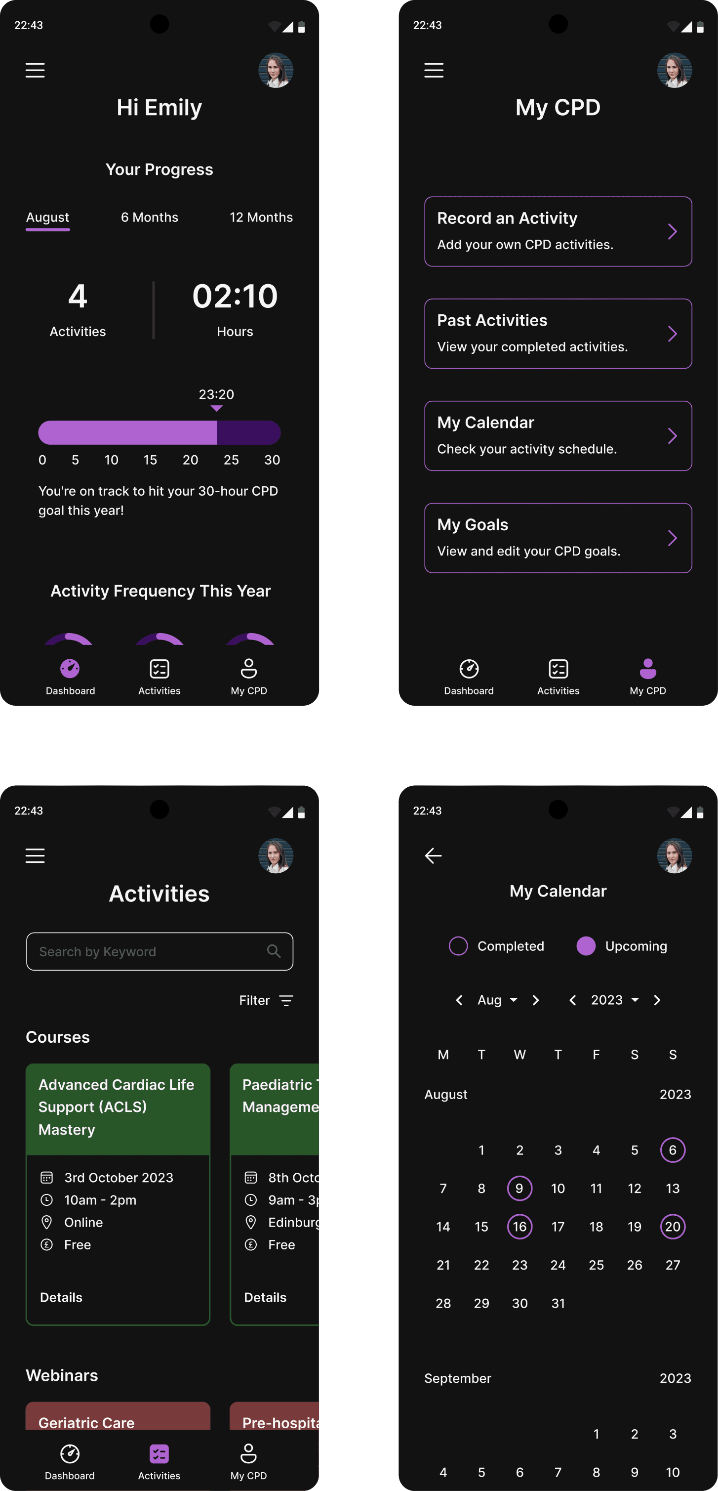
After several days working on the information architecture I settled on 3 main sections for the app, 'Dashboard', 'Activities' and 'My CPD'. Further options can be accessed via the hamburger menu. This decision aligned with the aim of designing an app that was not overwhelming.
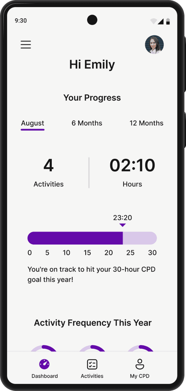
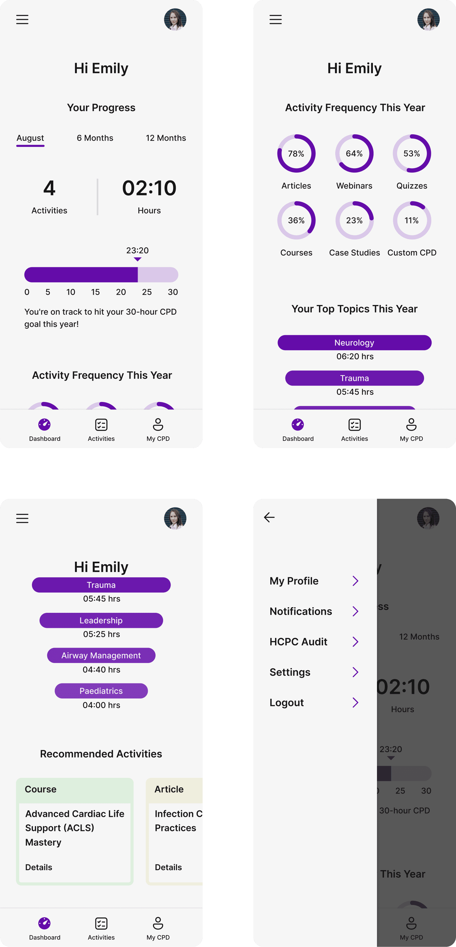
Dashboard
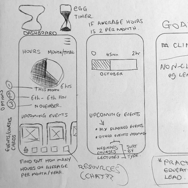
Research highlighted the significance of monitoring both the number of hours and the type of CPD completed.
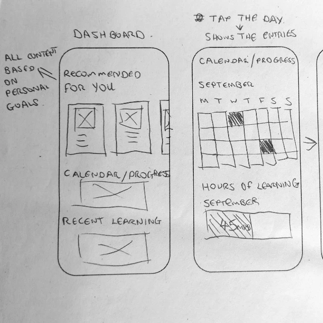
This insight led to the creation of a simple and clean dashboard that provides a clear overview of completed hours and past learning areas.
Additionally, the inclusion of recommended activities serves to encourage learning in diverse topics.
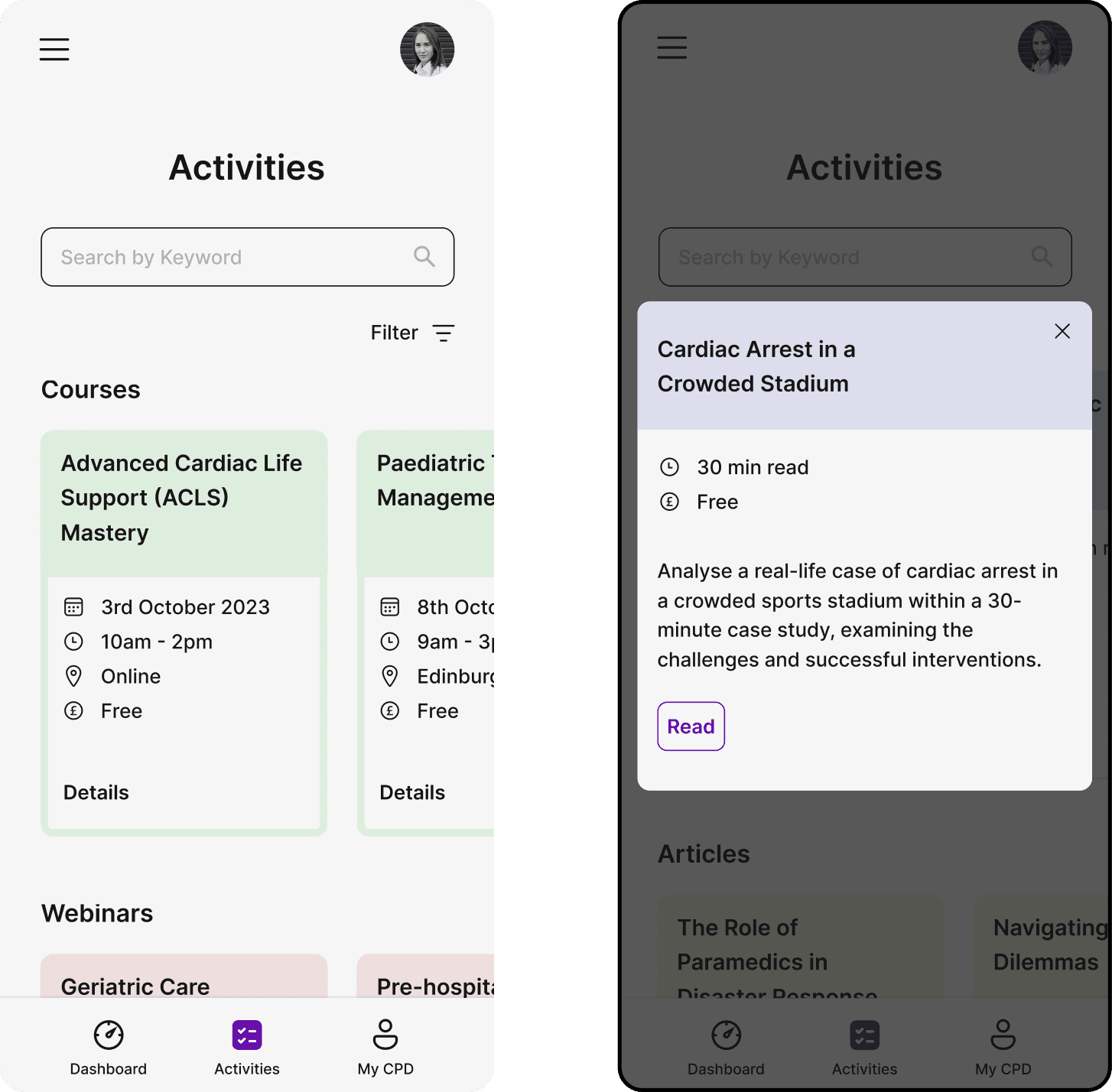
Activities
Available activities are broken down into courses, webinars, articles, case studies and quizzes.
Scrollable cards allow for easy browsing and selection. Colour coding helps by visually distinguishing the different activity types.
Each activity can either be added to the users calendar in the case of courses and webinars or accessed immediately in the case of articles, case studies and quizzes.
Design Insight:
Cards were the obvious choice for grouping the activities together as they are a very common UI element and the majority of users will be familiar with them.
A modal was chosen as it focuses the users attention.
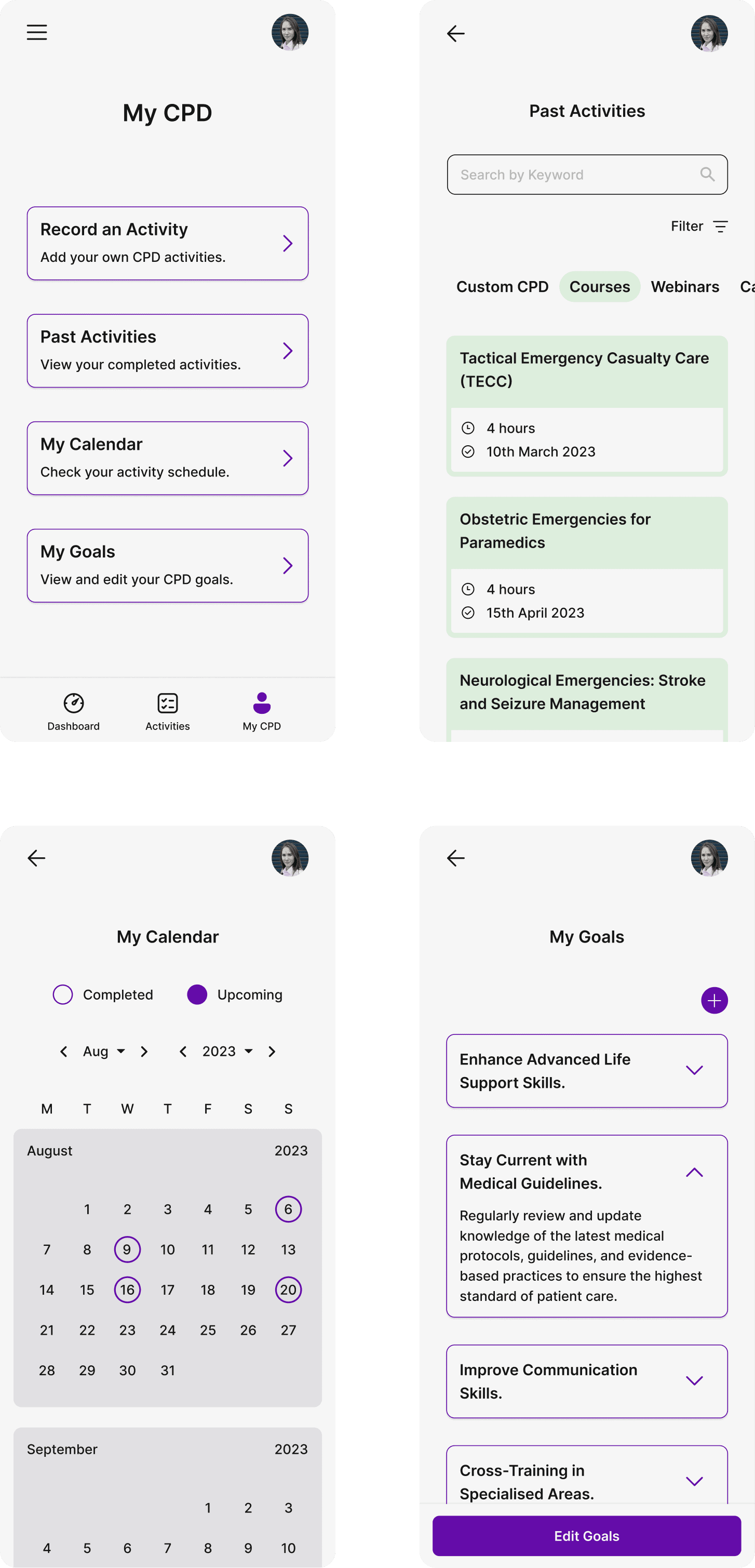
MY CPD
CPD includes activities that clinicians have undertaken themselves such as conversations with colleagues, reflective practice, mentoring etc.
In the "My CPD" section, users can record these activities using forms, ensuring comprehensive data entry and supporting documentation uploads. Additionally, a dedicated form allows users to provide reflective accounts.
My CPD is also where past activities can be reviewed, the calendar can be accessed and personal CPD goals can be added and edited.
Design Insight:
Simple arrow icons on My CPD and My Goals confirm they are tappable. I chose to layout the Past Activities cards vertically to differentiate from the Activities cards. The calendar is a familiar layout and easily navigable.
Long Nights and Tired Eyes
There is a growing preference for dark themes within apps. Many clinicians also work night shifts so the inclusion of a dark mode reduces eye fatigue at any time of day but particularly during a long nightshift.
User Testing
As with many prototypes it does not have full functionality but enough to serve as a good test bed for user testing.
I undertook testing on a one to one basis with 10 users. Their ages ranged from 19-52 years old with years of experience between 1 and 28. I did not use available user testing software or platforms so I simply observed as the users performed the tasks.
I asked users to complete the following tasks starting from the dashboard:
1: Find and view a webinar on geriatric care and add it to the calendar.
8 users completed the task with 2 abandoning it.
2: View the reflective account of the activity completed on 9th August.
This can be achieved by using the calendar or searching past activities. 6 users used the calendar and 3 used past activities. 1 user abandoned their attempt.
3: Add a Goal.
All 10 users successfully completed this task.
I also let them freely "play" with the prototype exploring all sections. I then asked for their overall feedback on the UI and UX. As the users were my colleagues I emphasised the importance of honest feedback.
Feedback was very positive with an emphasis on the clean UI and ease of navigation. Colour coding of activities was seen as positive whilst 1 user felt the MyCPD screen was lacking something and felt bland.
The activities link in the tab bar caused some confusion as some users thought this was the past activities section. Onboarding screens on first use could resolve this issue.
Several suggestions were also made, including:
adding a calendar widget to the dashboard
a traffic light colour system showing where areas of study may be lacking
integrating goals into the dashboard
To Wrap Things Up
Designing an app from nothing to a functional prototype was challenging, particularly when working alone while juggling other commitments.
However, I successfully accomplished my initial objectives. The satisfaction gained from designing an app with the potential to address a real-world problem was highly satisfying and the feedback from users was very reassuring.
Working alone and staring at the same screens for weeks on end led to occasional oversights with the design.
To help I regularly shared my progress with my online design community. Their constructive feedback and advice was so helpful in keeping me on track and focused.
Immersing myself in the whole design process expanded my tool kit significantly. From UX research to furthering my UI design knowledge and Figma skills.
Overall, this project was a big task but extremely rewarding and educational.
