November 2023 - January 2024
Increasing Sign Ups and Driving Business Growth
A Website for a Local Driving School
Summary
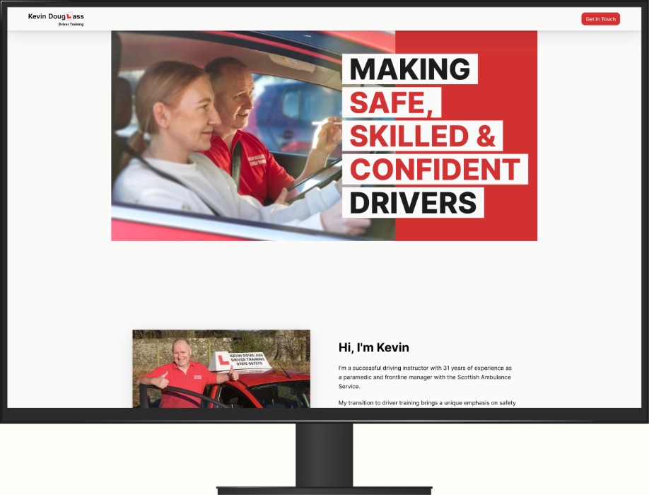
I designed and launched a website for a local driver instructor.
Outcome
Significantly increased driving lesson inquiries and student applications, effectively driving business growth and enhancing the school's online presence.
Project Type
Website.
Elements Within My Role
Responsive web design, UI design and graphic design.
View the Website
“Darren’s professionalism was very impressive. He had loads of ideas and we jointly followed them through to an amazing website for my business. Things have really taken off.”
- Kevin Douglass
The Client's Needs
During an initial meeting with the client they highlighted the significance of a website that not only showcases the service they offer but also effectively conveys professionalism and instils trust in potential students.
The website must also convey the information that potential students regularly enquire about and additionally, the client expressed the need for users to access an application form through the website.
The User's Needs
Users are looking for a trustworthy and reliable instructor who can provide them with the skills and knowledge necessary to become safe and confident drivers.
They need a source of information about the instructor, pricing, lesson structure and geographic area covered. Additionally ease of contact is essential.
Project Plan
The project plan comprised of 3 key phases:
Content Creation
Design and Development
Testing and Launching
Timeline
To ensure a smooth and effective project flow, I mapped out a comprehensive timeline for each phase.
This timeline was flexible and open to the client’s feedback and approval at every stage.
Content Creation (Week 1-2):
Collaborate on content strategy and refine the website's message.
Develop and gather textual and visual content.
Ensure content aligns with brand messaging and project goals.
Design and Development (Week 3-5):
Present initial design concepts for review and feedback.
Refine the chosen design based on the client’s input.
Finalise the overall look and feel of the website.
Testing and Launching (Week 6-7):
Conduct testing to ensure functionality and responsiveness.
Address any identified issues.
Launch the final version of the website.
Content Creation
In this initial phase, myself and the client met for a content strategy meeting. The outcome was a clear understanding of what content the client wanted in the website.
The following content was agreed upon:
Hero section
About the client
Pricing
Lessons
Testimonials
Geographic area information
FAQs
Contact information
A means of downloading the application form
Building on this I suggested the design and development of a fully responsive single-page website to ensure accessibility and a visually appealing experience across various devices.
To meet the request for the application form, I recommended incorporating a download button linked to the existing PDF application form.
Design and Development
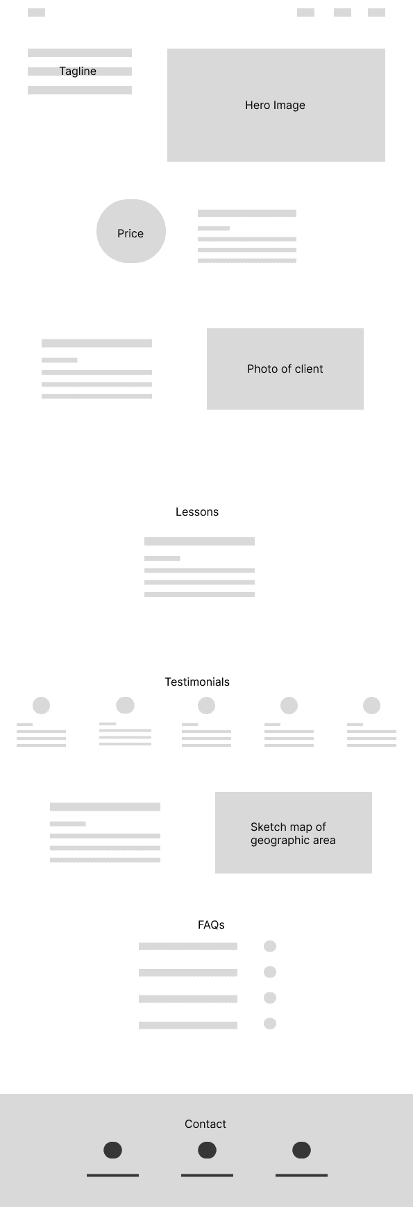
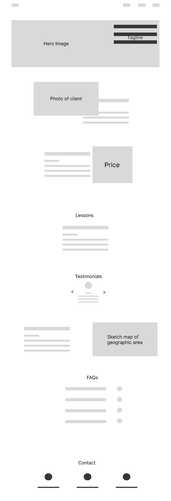
Wireframes
Hero Image and Tagline
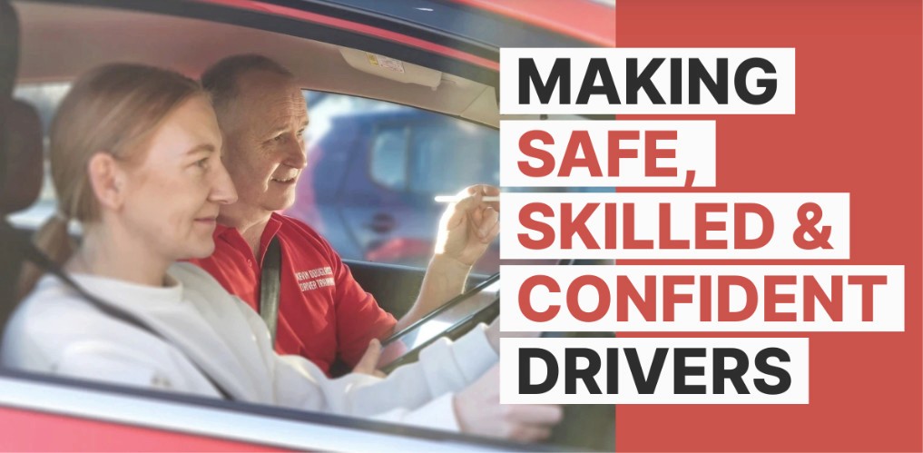
The hero section with the tagline "Making Safe, Skilled, and Confident Drivers" and an image of the client instructing a student serves as a powerful introduction, immediately communicating the instructor's mission and expertise.
This section creates a strong first impression, demonstrating professionalism and expertise, which aligns with the client's goal of instilling trust in potential students.
About the Client
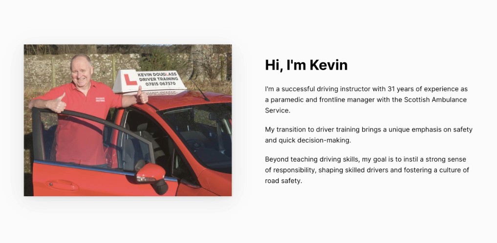
The photo of the client with a positive, friendly pose next to his car with supporting text introduces the instructor and provides background information.
Including personal information about the instructor helps potential students connect with the instructor, fostering trust and rapport.
Pricing
The bold design and animation serves as a focal point, catching the user's attention and making the price clear.
Lessons
Text explaining the client's teaching style and structure of lessons, provides clarity and enhances transparency and trust.
Testimonials
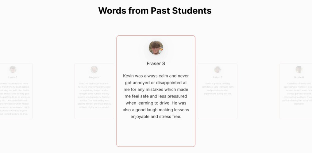
Testimonials from past students are showcased in cards with avatar images and quotes in a horizontal carousel.
Featuring testimonials builds credibility and social proof, reassuring potential students of the instructor's expertise and the quality of the learning experience.
Geographic Area
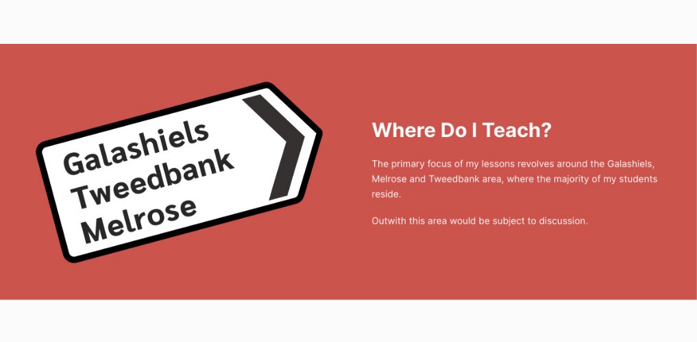
Highlighting the geographic area covered by the instructor addresses a common concern for potential students, ensuring they are within the service area and increasing the likelihood of inquiries from interested individuals.
FAQs
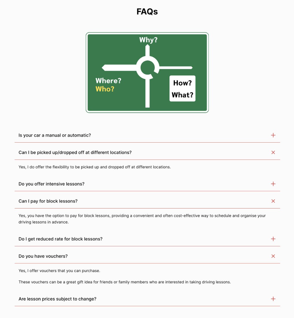
An accordion FAQ section with a fun graphic provides answers to common questions.
By addressing frequently asked questions in an easily accessible format, this section helps in the decision-making process for potential students, enhancing user experience and trust.
Contact Information
Providing interactive icons for Facebook messenger, phone and email provide convenient means of contact making it easier for potential students to reach out.
Road Signs
Incorporating custom-designed UK road signs into the website adds a unique and relevant touch to the overall design. Both drivers and non-drivers will recognise these familiar designs.
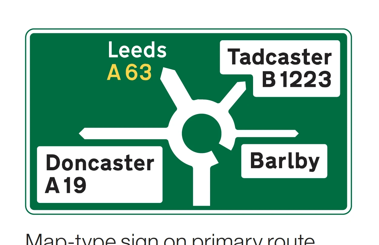
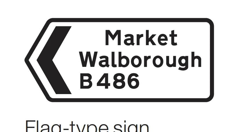
To ensure accuracy, I referenced the booklet "Know Your Traffic Signs" from the UK government.
For the FAQs section, I chose the roundabout ahead sign. Its depiction of multiple directions reflects the range of questions users might have.
The black and white direction sign contrasts well with the red background and was the best choice for listing the towns that the client covers.
Colour Scheme and Animation
The red and white colour scheme, inspired by the client's red car and the 'L' plate used by learner drivers, creates a cohesive and visually appealing design. Subtle animations, such as the sliding tagline and enlarging price, add visual interest without overwhelming the user.
In addition the colour scheme reinforces associations with driving lessons, while animations draw attention to important elements, contributing to a memorable user experience.
404 Page
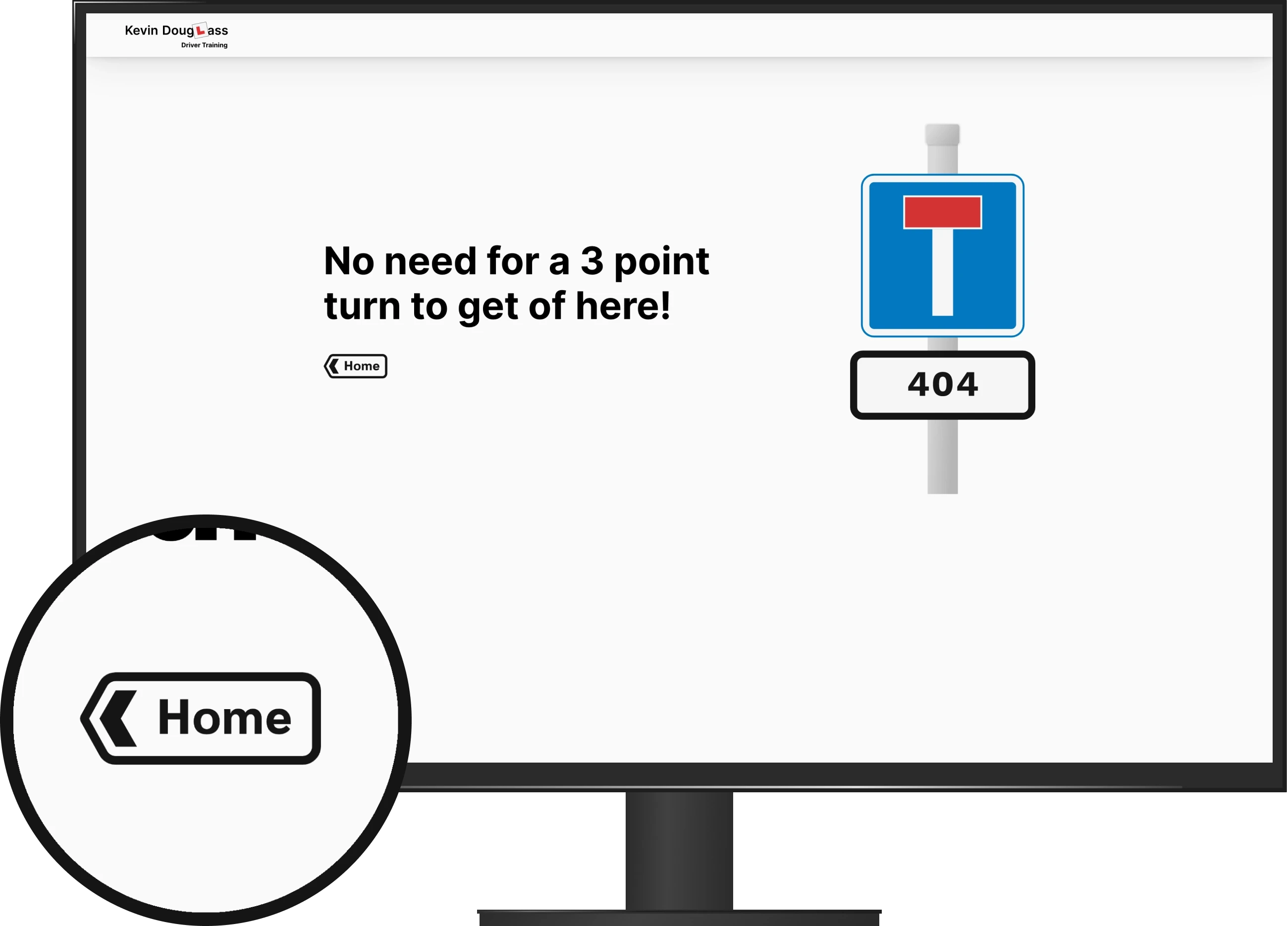
404 pages can be dull so I decided to add a little humour. Continuing with the road sign theme the obvious choice was a 'No Through Road' or 'Dead End' sign.
The 'Home' sign acts a button to return to the homepage.
Testing
As the website is a single page (plus a 404 page) there was limited testing required. the main focus was to ensure that it was fully responsive on a range of devices.
Testing across various devices, including mobile phones, tablets, laptops, and monitors, confirmed that the responsive design functioned as intended. Additionally, all buttons in the final design were fully operational.
Application Form Problem
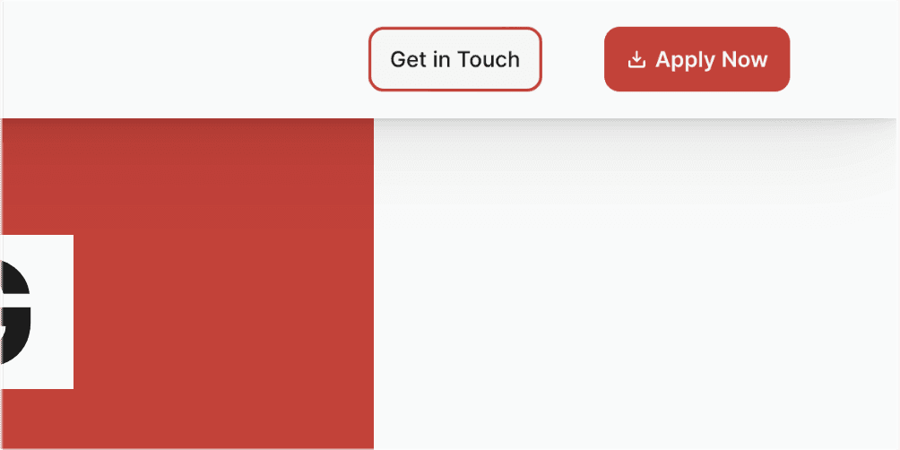
The initial plan involved adding a button for downloading the PDF application form. When testing using my devices, the button successfully prompted users to download or view the PDF.
However, during further testing, it became apparent that some users' devices failed to prompt downloading or viewing. Despite attempts to solve this, the issue persisted.
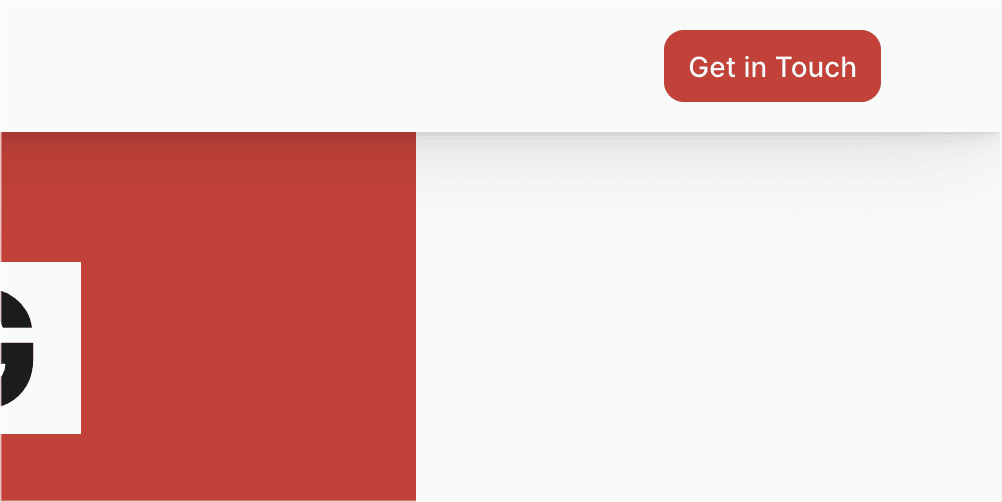
After discussing with the client, we agreed that placing instructions to request the application form under a "Ready to Apply?" heading would serve as a viable alternative.
While this solution does work, it not ideal. A potential solution could involve using custom code for the button but this exceeds my current skill set.
Original design with download button CTA and secondary contact button.
Updated design with contact CTA.
Road sign imagery © crown copyright 2023.
