March - July 2023
Reducing User Frustration While Improving Accessibility and Safety
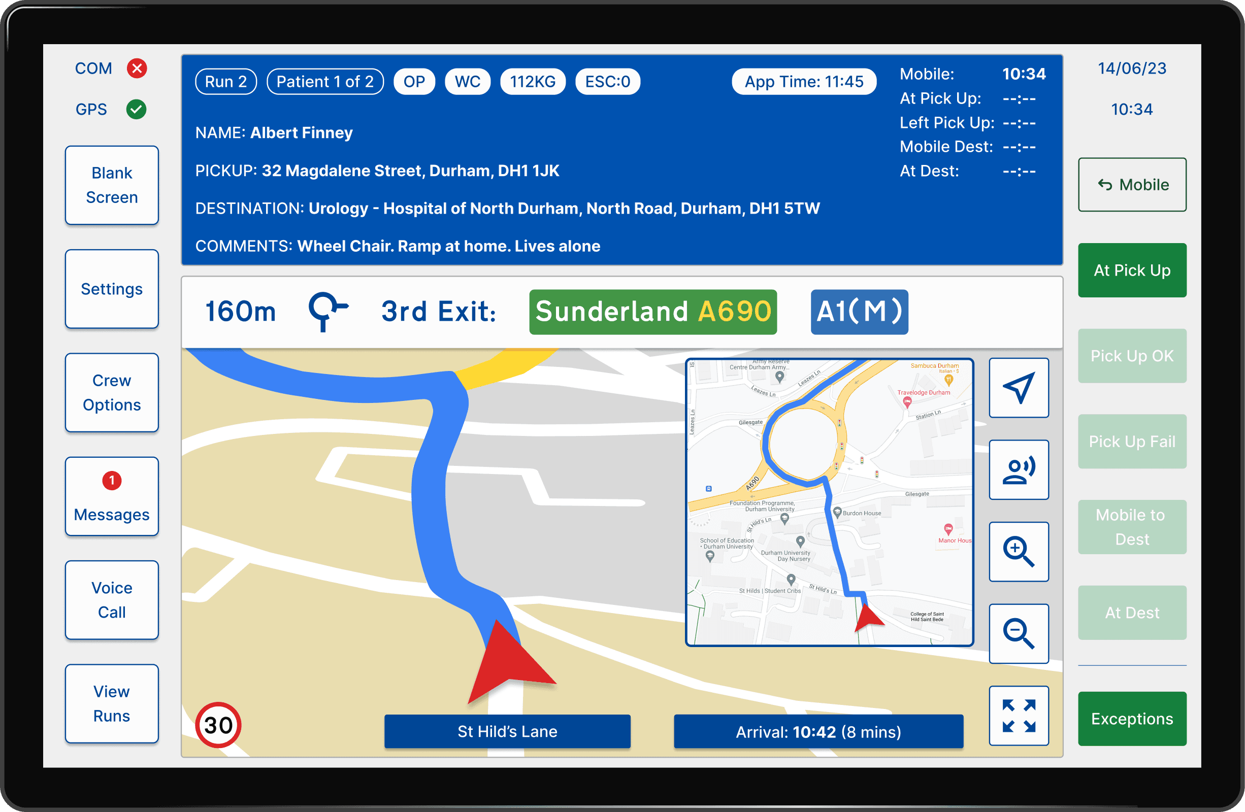
Refreshing UK Ambulance Services Patient Transport App
Summary
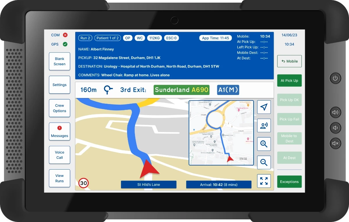
I redesigned the UI for an app widely used by UK ambulance services to manage non-emergency patient journeys, meal breaks and communications.
The primary objective was to address the various issues rising from the outdated UI and enhance the overall UX for ambulance crews.
NOTE: This is an unsolicited redesign.
Potential Benefits
Improved UX for colour blind users
Reduced frustration with meal break procedure
Improved safety with a new dark mode
Reduced training time and costs
Project Type
Redesign.
Elements Within My Role
UI design, UX research, prototyping & user testing.
"The colour scheme is way better"
100% of users preferred the new meal break flow.
"That is so much easier to read"
80% of users felt the layout was an improvement.
Ambulance or Time Machine?
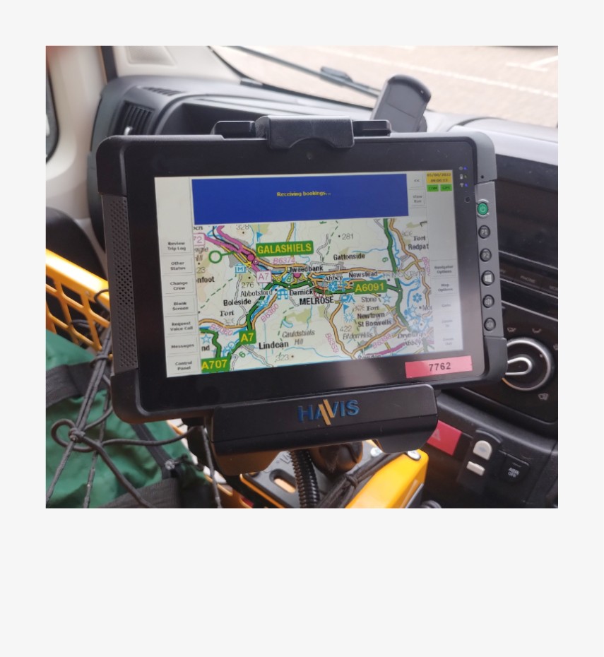
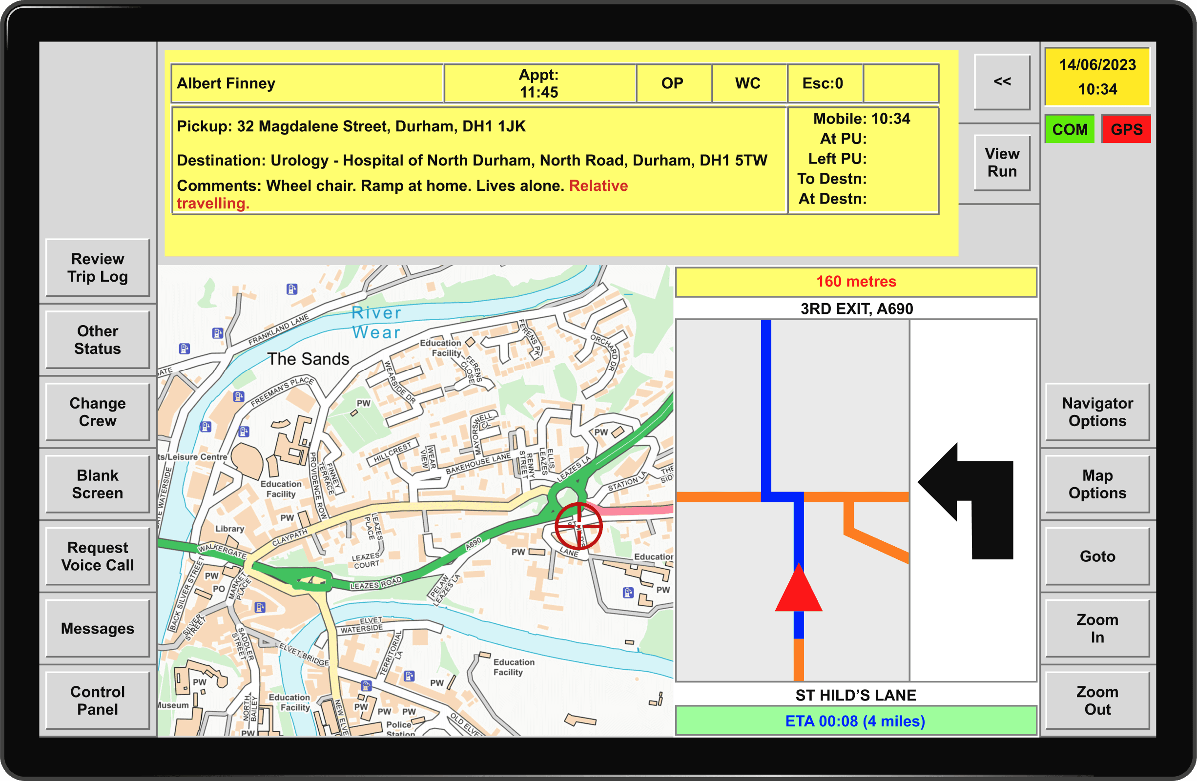
The Ambulance Service relies on an outdated, older Windows UI based application, to manage non emergency patient journeys, meal breaks and other communications.
This leads to frustration which in turn can have an adverse effect on service provision and patient care.
Crews require an app with improved user flows and a modern user centric UI which is effortless to use.
The colour scheme poses accessibility issues for colour-blind users
Screen brightness can be distracting and cause eye strain in low light conditions
Buttons are cramped, leading to accidental taps and user confusion
The most commonly used buttons are not always visible
The 'meal break' procedure is awkward.
The satellite navigation (GPS) is outdated
User Becomes Designer
While working as a patient transport care assistant with the Scottish Ambulance Service, I chose to redesign the app I used everyday.
Having a firsthand understanding of the pain points and being connected with my colleagues, who were also users, I could treat the redesign as a UI/UX project.
As the sole designer, I handled UX research, UI design, prototyping and testing.
Drawing on my experience as a user and insights from colleagues, I quickly identified issues through interviews and observations, forming a problem statement and pain point list.
The main focus of the project was revamping the UI and creating a functional prototype.
More of a Refresh Than a Full Redesign
Feedback suggested avoiding a complete overhaul of the UI as users are familiar and comfortable with the existing layout.
Introducing an overly complex or flashy UI may distract users and increase cognitive load. Additionally, an entirely new UI would require additional training for users, which could be time-consuming and costly.
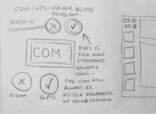
Solving accessibility issue with COM/GPS iconography.
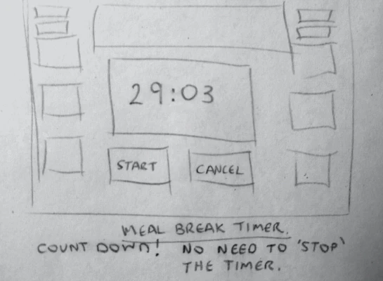
Thinking about the meal break timer.
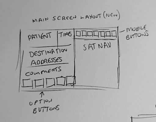
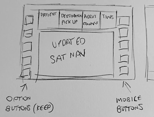
A completely new screen layout which was disregarded.
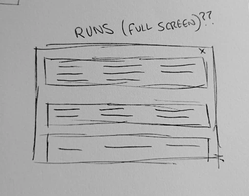
Thinking about how to display patient details (runs).
A screen layout similar to the current design.
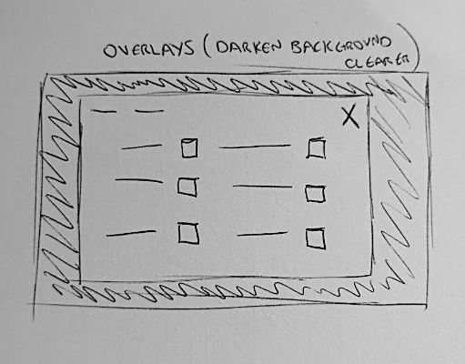
Using modals.


Meal break flow wireframes - the layout is similar to the current app.
Goodbye Windows 95!
Typeface
Instead of reusing Arial, which is the current typeface, I opted for Inter due to its excellent legibility at smaller sizes.
This is important as tablet screens can be small.
I only used 2 weights throughout the design for clarity.
Iconography
Updating the UI involved incorporating recognisable icons.

Checkboxes & Buttons
The introduction of colour demonstrates clear visual hierarchy.
Chips
The addition of chips clarifies and highlights important patient information.
Button Placement
Current.
Mobile Status Buttons
These buttons are pressed at each stage of the journey.
They are now a contrasting green and have been moved to the right side of the screen, improving their accessibility and visibility.
They have also been streamlined with fewer buttons and 'undo' is now a button state.
Refreshed.
Option Buttons
I enhanced the option buttons by enlarging, increasing white space and relabelling them.
Frequently used 'Blank Screen' and 'View Runs' were moved to the top and bottom for easier selection.
A badge was added for indicating message count.
Current.
Refreshed.
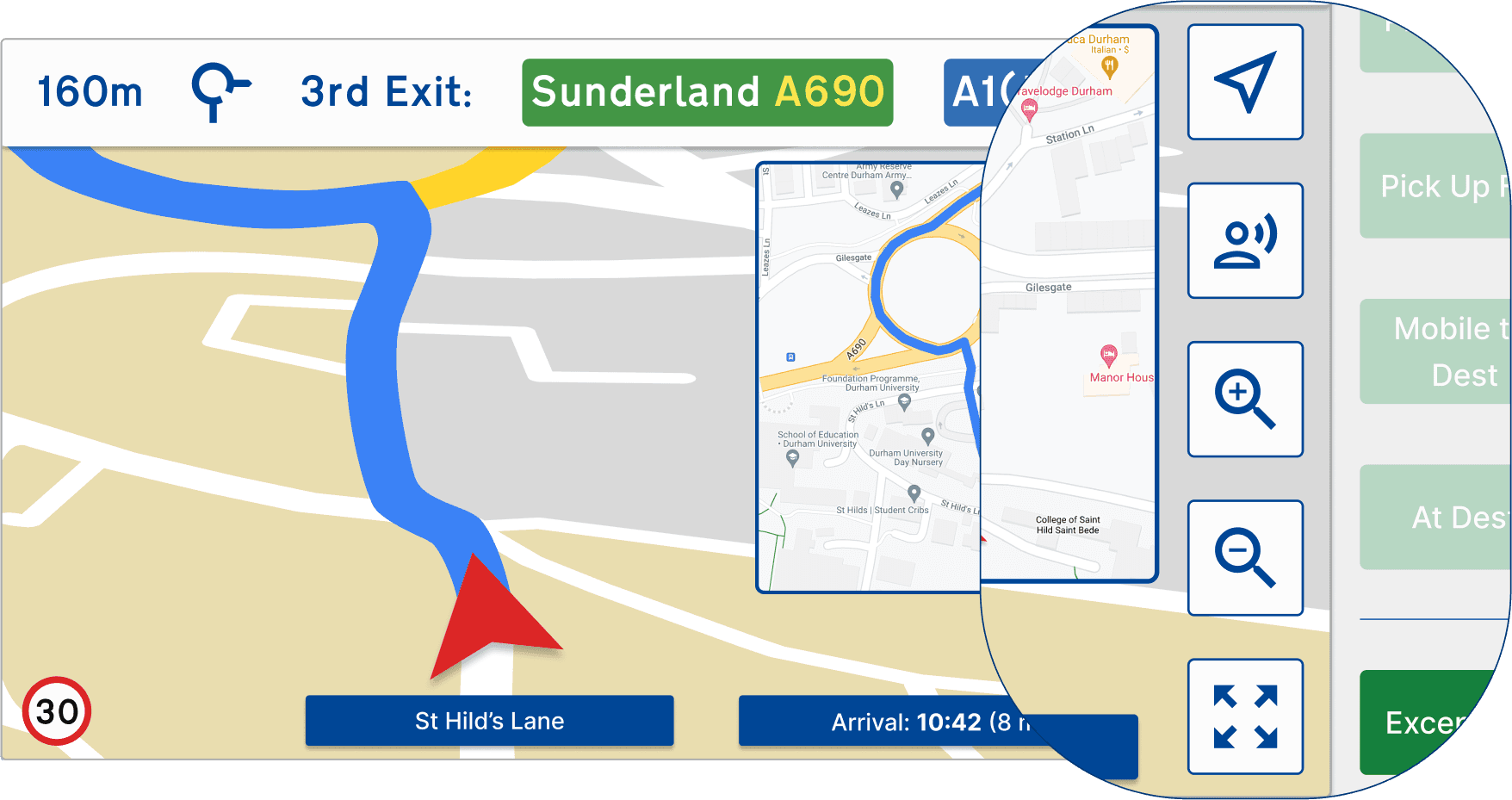
Satellite Navigation (GPS)
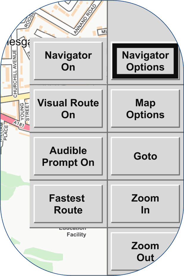
To address user complaints about the numerous option buttons for the current sat nav I would replace it with a modern system designed for touch screens.
In the prototype I have represented it as a graphic. I demonstrate icon buttons that could replace the current buttons.
Current sat nav buttons.
Updated sat nav with icons.
Adding Visual Cues and Meeting Accessibility Standards
WCAG Standards
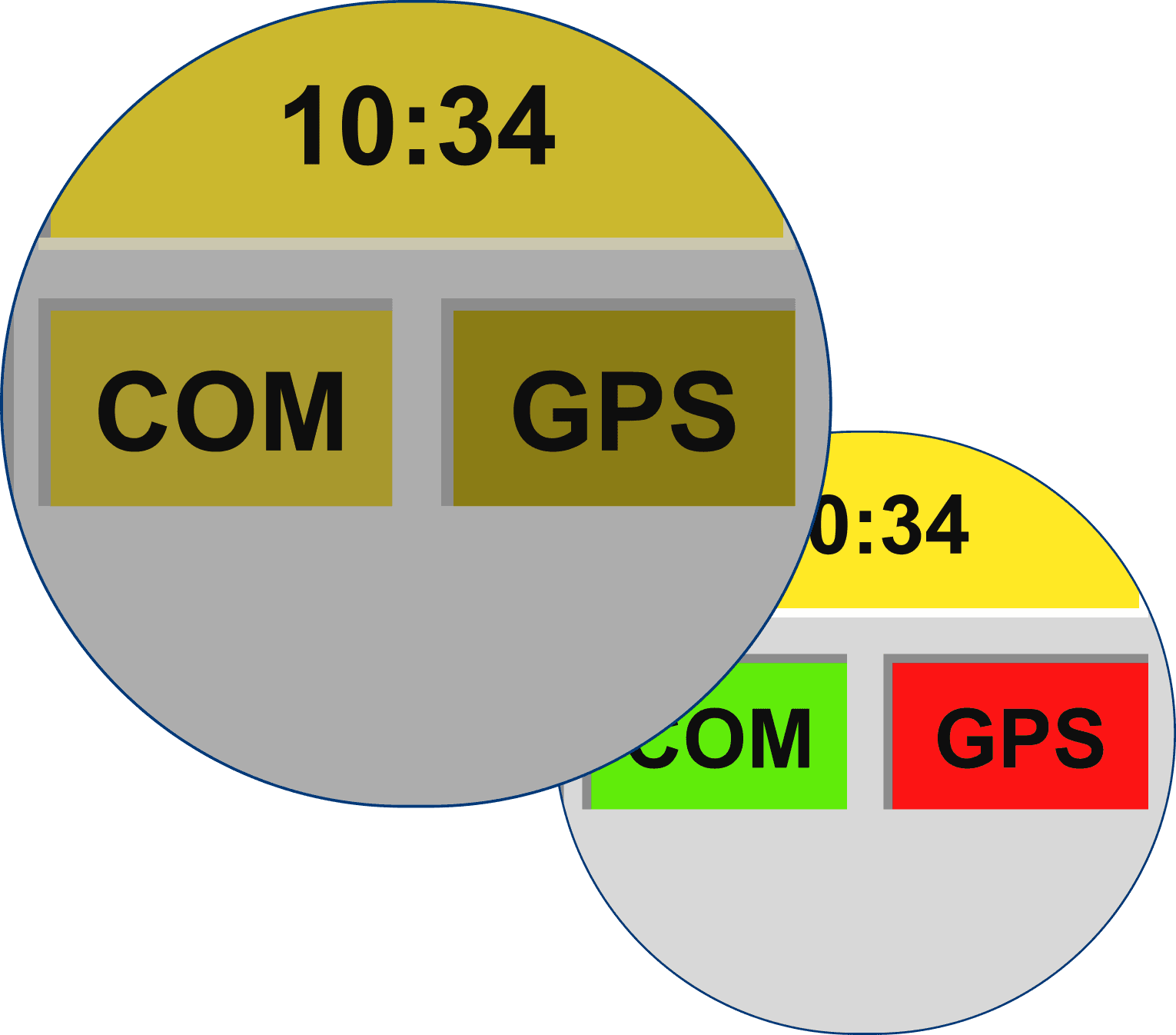
There are issues with the current colour scheme. Important additional text and the COM/GPS status indicators all fail to conform with WCAG AA standards.
The new colour scheme conforms to WCAG AA standards for both text and graphics, while the combination of blue and white meets the more stringent AAA standard.
Colour Blindness Types
Deutan and Protan are the two most common colour blindness types. Users with either of these types are 'red-green' colour blind.
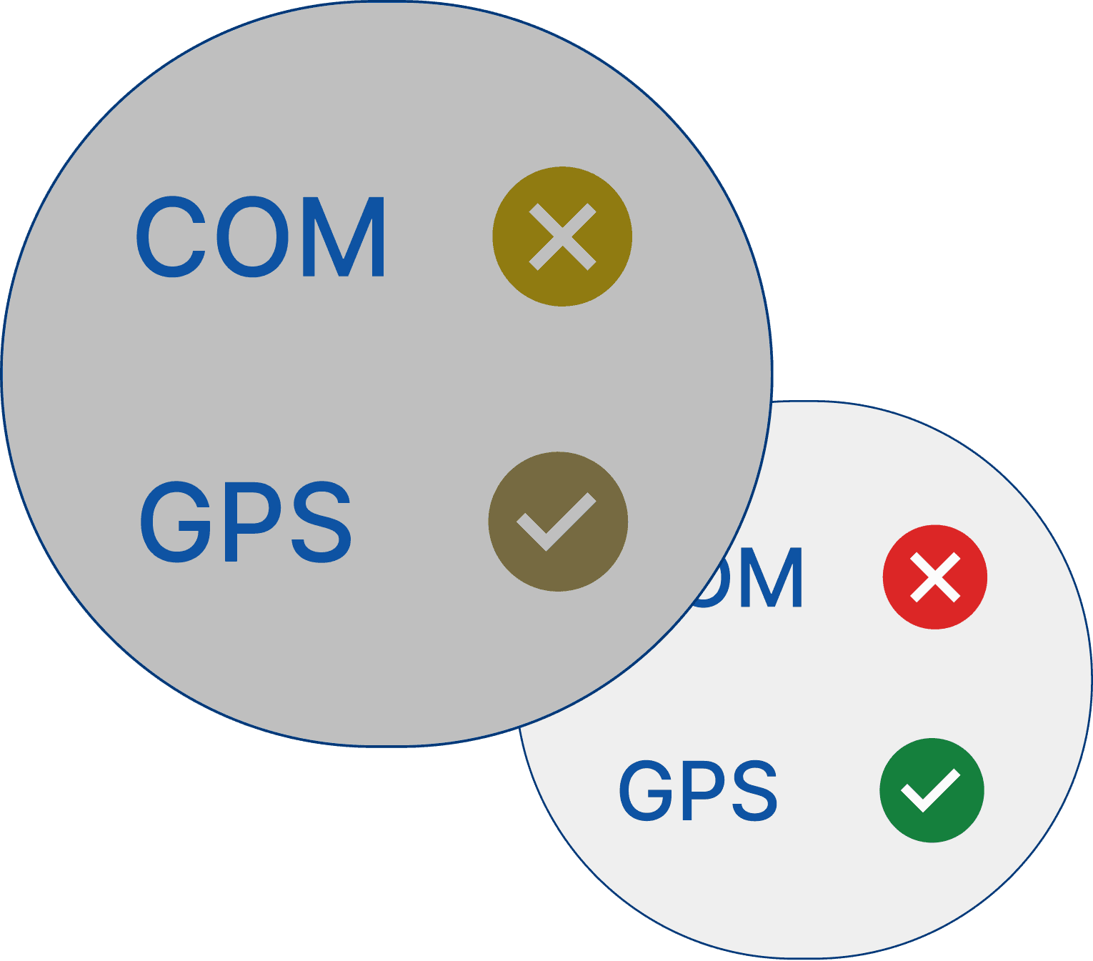
Adding Iconography
The images below show how the current and refreshed COM and GPS indicators look to a user with Deutan colour blindness. The addition of icons gives a secondary visual cue to colour blind users.
(The smaller image shows how it appears to users without visual impairment.)
Current.
Refreshed.
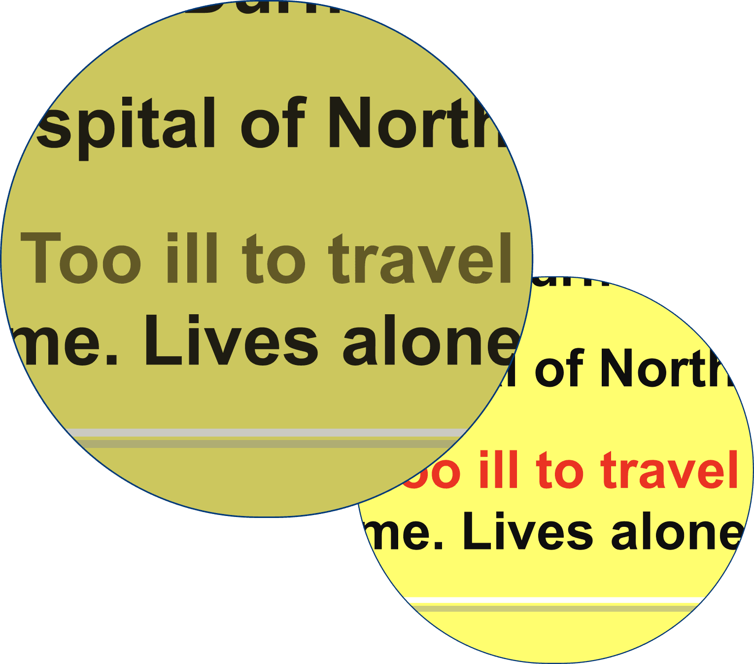
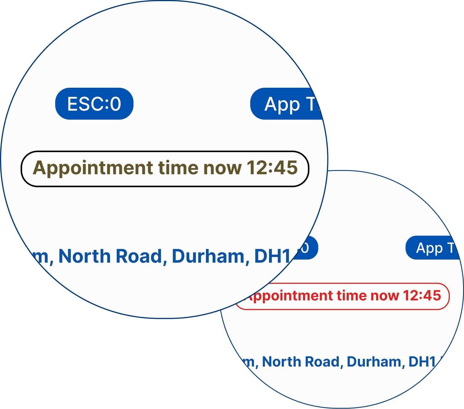
Red on Yellow, Really?
Red text on a yellow background is clearly a bad choice when it comes to meeting WCAG standards.
In the refreshed design I replaced yellow with white and added a border to important text to add a second visual cue. The examples below shows how it appears to users with Protan colour blindness.
Current.
Refreshed.
Reducing Frustration for Hungry Ambulance Crews
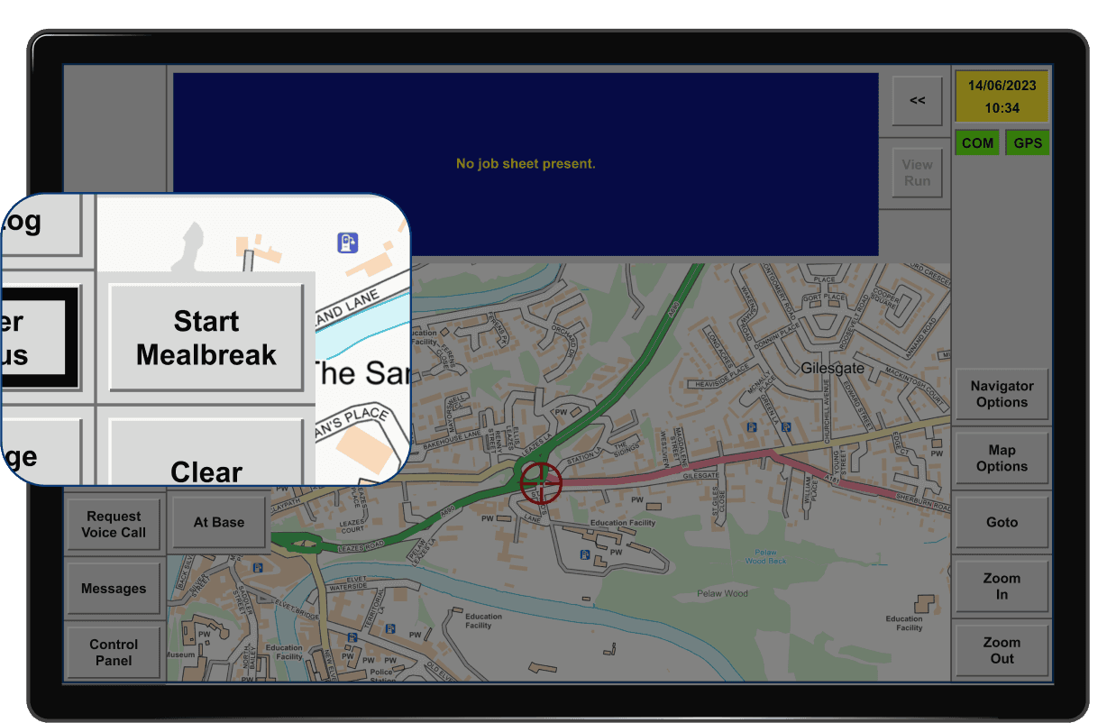
After a meal break crew members must return to their vehicle to ‘end’ their break by stopping a count-up timer. This is a significant pain point for many users.
Current.
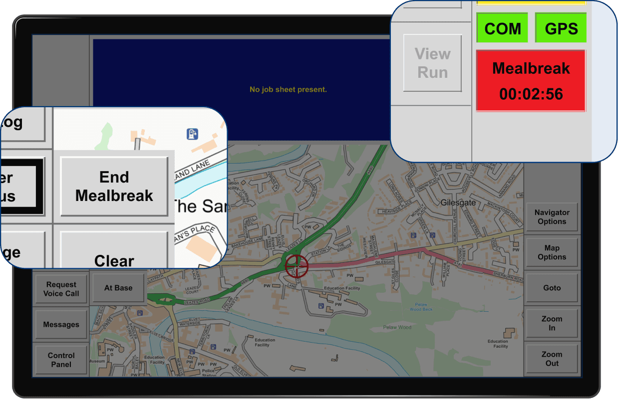
To address this issue, I introduced a timer that now counts down from the allotted break time, for example 30 minutes. This removes the need for crews to return to the vehicle which reduces frustration.
100% of users test found this addition to be a highly beneficial addition.
The new meal break timer.
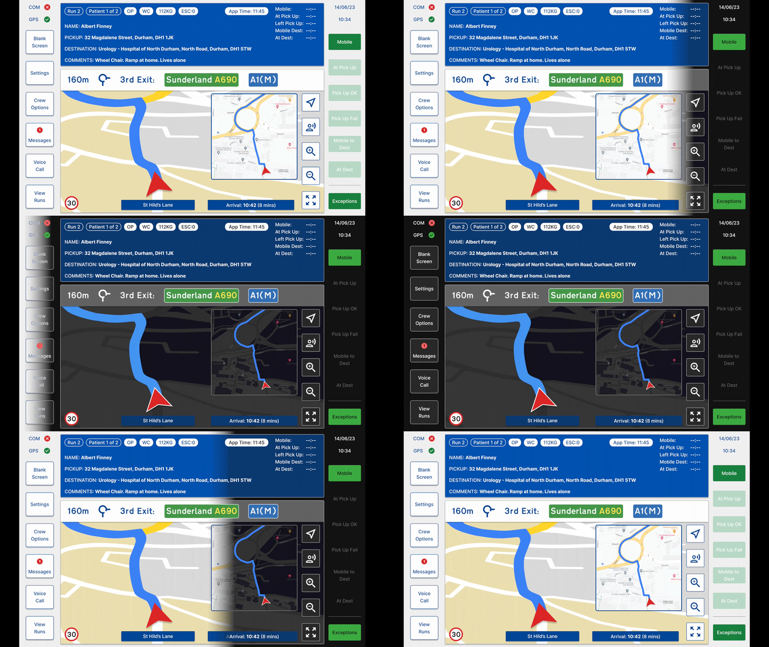
Improving Safety and Reducing Visual Discomfort
In low light conditions, particularly when driving at night, users reported that the glare from the screen can be distracting.
While there is an option to lower the brightness, it often leads to text being too dark and illegible, making it challenging to find the correct brightness setting.
Introducing a dark mode ensures continued legibility with reduced glare, enhancing comfort and improving safety.
User Testing
Prototype testing was conducted with 10 users. I asked them to imagine they were sitting in the ambulance and to go through each step for picking up and transporting each patient to hospital.
7 out 10 user's completed the task easily. 3 users became stuck with selecting the patient. They were used to a 'select' button and did not realise to tap the patient details for selection.
I also asked them to start a meal break. All 10 completed this task with ease.
The GIF below shows the correct steps to complete the test.
The flow that users were asked to complete.
"It's so much clearer"
"Larger details screens would be good"
"I love the new meal break timer"
"It still feels cramped to me"
"It's simpler to use"
User Feedback
Overall, the feedback on the prototype was positive, especially regarding the improved colour scheme and updated UI elements. All 10 users agreed that the meal break timer was a notable improvement.
However, a few users pointed out that the badge indicator on the messages button was too small and lacked the visibility needed to grab users' attention effectively.
While the removal of the 'select' buttons posed a challenge for some users, it was noted that with time and familiarity with the new design, this wouldn't be an issue.
The introduction of a night/dark mode received positive feedback, with two users expressing that they would use it all the time. Additionally, a colour-blind user appreciated the acknowledgment of colour blindness and found the inclusion of iconography to be a significant improvement.
On the other hand, some users felt that the screen layout was still cramped, especially on the patient details screens, which could benefit from being larger. This becomes a challenge given the 8" tablet size in the ambulance. To address this, a more extensive redesign might be necessary.
Did I Take on Too Much?
I might have gone overboard with this project, attempting a complete overhaul of the app. I spent excessive time on details like the sat nav and messaging feature (not included in case study), even though the latter wasn't a major concern for users.
In hindsight, focusing on a couple of key user flows would have been more efficient.
Despite the lengthy project duration, I successfully addressed the main pain points and implemented a modern UI and UX. The experience also allowed me to enhance my skills in Figma and Protopie.
An interesting aspect was exploring colour blindness and accessibility, heightening my awareness of it's significance for future projects.
